CASO DE ESTUDIO
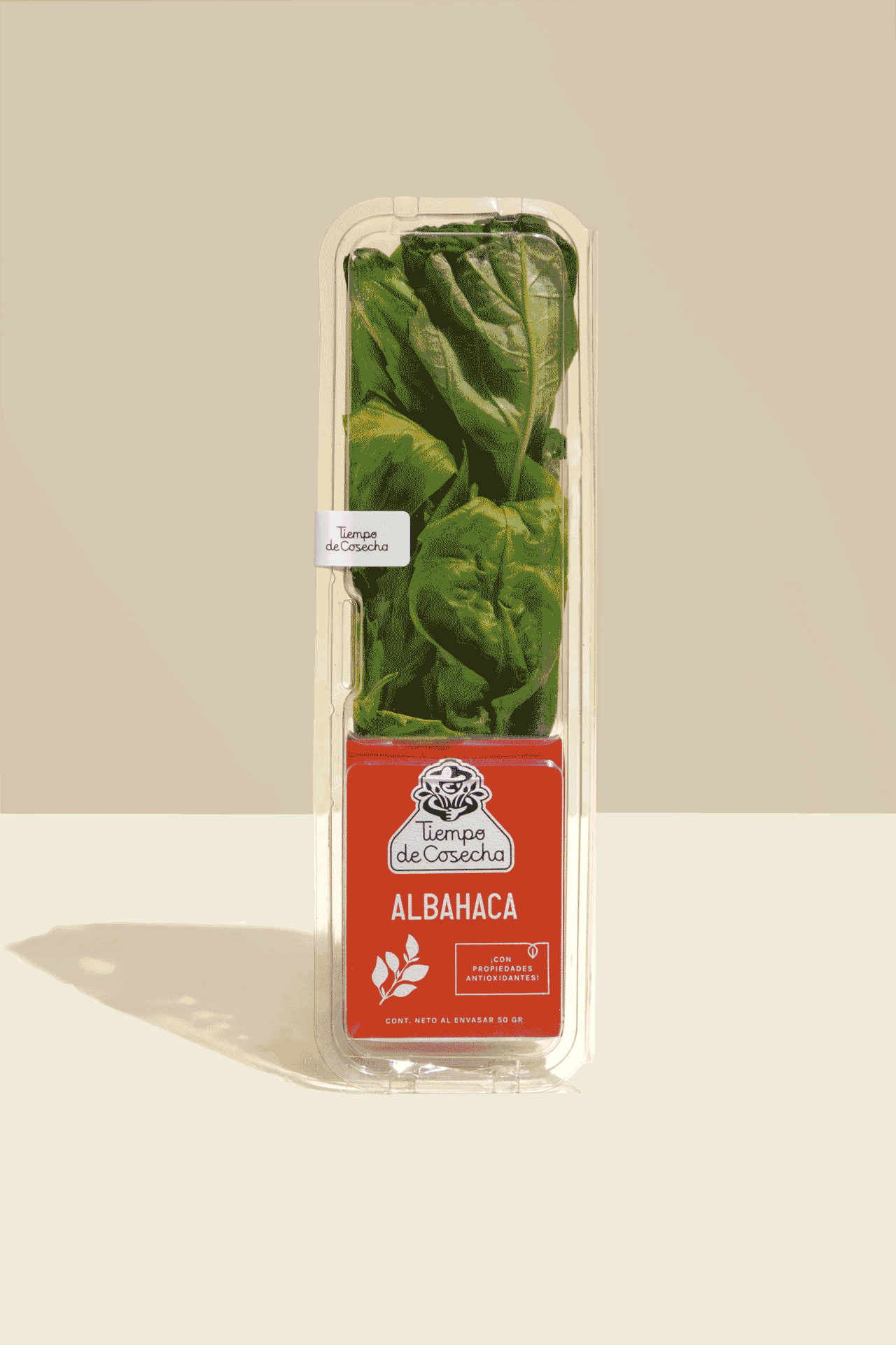
Tiempo de Cosecha es una marca mexicana dedicada a ofrecer hierbas frescas y productos derivados de alta calidad. Aunque sus productos ya formaban parte de la vida de muchos hogares, la marca enfrentaba un reto: sus consumidores no la recordaban. Para resolverlo, buscamos evocar la vida al aire libre, los campos y los sabores caseros de siempre. Creamos un logotipo memorable protagonizado por un hombre en plena cosecha, acompañado de una tipografía cursiva que aporta calidez y tradición. En los empaques, el nombre del producto ocupa el lugar principal, pensado especialmente para su público: familias y personas de mediana edad que prefieren identificar el tipo de hierba con facilidad, sin complicaciones. Hoy, Tiempo de Cosecha ofrece una amplia variedad de productos —desde hierbas frescas y aderezos hasta salsas, condimentos, pan y bebidas— sumando más de 50 opciones que llevan el sabor del campo a la mesa.